Even superheroes upgrade their suits, and apparently, so do logos!
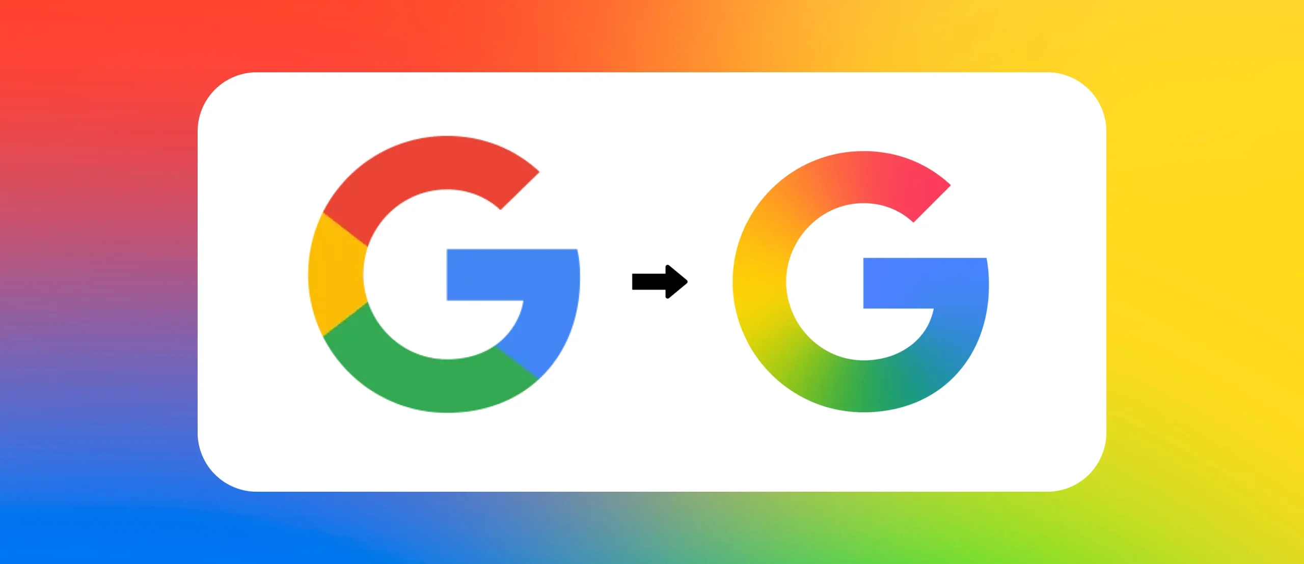
Google’s latest redesign of its iconic “G” may look like a minor update, but this is actually a tactical and deliberate rebranding for the age of artificial intelligence. The way Iron Man evolved from steel to nanotech, this gradient is a symbol of transformation, flexibility, and future convergence and not just an improvement in looks. And Google deployed it with the quiet stealth of a software upgrade, as is the tradition.
The change’s strategic message is much more subdued but far more significant. This is one of signaling a coherent brand language designed for an AI-enabled product ecosystem, not color mixing for sheer beauty. In the case of such systems as Gemini, the new “G” aligns with Google’s broad mission to smart, connected experiences.
A 2025 Gartner report states that 84% of consumers associate uniform design across devices with brand trust. This release continues Google’s emphasis on design consistency, visually placing it atop the tech world.
In this blog, we’ll explore how Google’s rebrand reflects deeper trends in logo design, brand strategy, and AI storytelling.
Google’s Icon Evolution [A Strategic Design Journey]
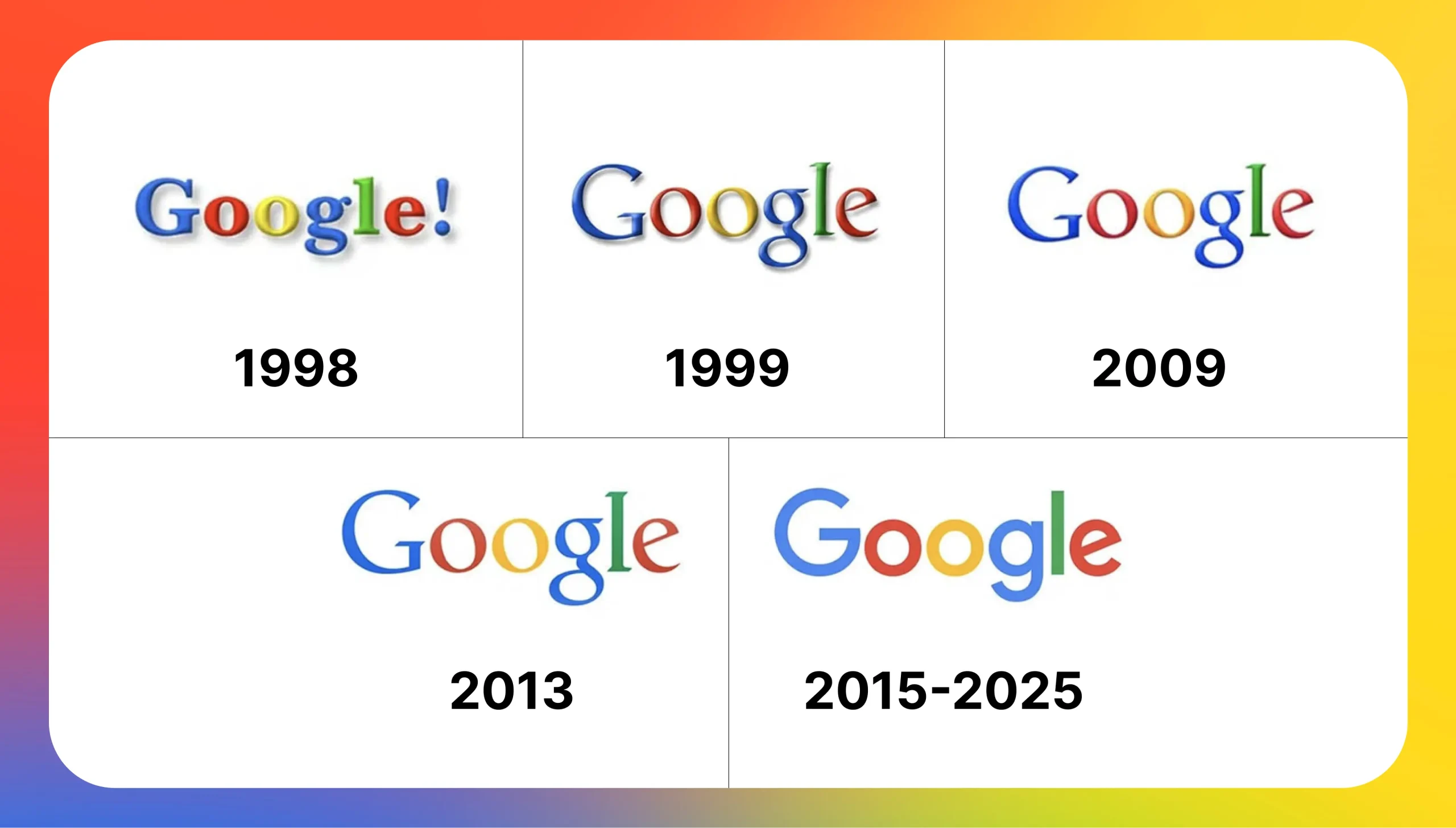
Since its establishment, Google’s logo has undergone several changes, mirroring its changing mission and technology. Most importantly, in 2015, Google released a new sans-serif typeface called Product Sans to supplant the old serif one.
The reason was to enhance clarity on various devices and screen sizes, responding to the company’s mobile-first priority.
Google’s Logo Evolution [A Visual Timeline]
Ever wonder how Google’s logo became the icon we know and love today? Well, their logo transformation is quite the tale; it mirrors trends in tech and user preferences.
| Year | Logo Update Description |
|---|---|
| 1998 | The first Google logo featured a serif font and an exclamation mark, reflecting the playful, experimental branding trend of the early web. |
| 2010 | Refinements were made for improved clarity, including tweaks to shadowing and letter spacing as Google matured as a global tech leader. |
| 2013 | Flat design took hold; Google removed drop shadows and adopted a cleaner, more minimalist look optimized for mobile use. |
| 2015 | A major overhaul introduced Product Sans (a geometric sans-serif typeface) and launched the multi-color “G” icon, aligning with mobile-first design needs. |
| 2025 | The most recent update adds a smooth gradient to the “G” icon, symbolizing AI integration, adaptability, and alignment with the Gemini AI visual identity. |
Each re-make was not only consistent with design trends but also with larger movements in Google’s platform agendas, user interfaces, and international branding priorities.
The 2025 ‘G’ Icon Revamp [A Closer Look]
The new version of the G redesigns the color blocks of the original logo into a descendant gradient of Google’s signature red, yellow, green, and blue. The design aesthetic mirrors Google’s Gemini AI branding, focusing on a liquid motion and interconnected segments.
Explore the following components to learn more about the guiding principles behind Google’s gradients and how they are executed with intention:
Implementations
- The gradient serves as a reminder that Google is all-in on integrating AI into every product it makes.
- By embracing a gradient, Google is sending the message of dynamism, responsiveness, and progressiveness, qualities needed in today’s rapidly changing technology world.
- The aesthetic matches modern logo design trends, where gradients provide depth, formality, and visual movement.
Impact on the Brand Identity of Google
Google’s image supports first users and ideas, reinforced by the new icon. Therefore, stressing Google’s goal to provide flawless experiences across all of its products, the gradient design suggests how well its solutions interface.
This update also suggests a shift toward a more mature and polished brand appearance, distancing itself from the light and basic aesthetic of the previous design. It offers a little indication of Google’s expansion from a search engine to a significant technological company leading the field in artificial intelligence development.
Designing Beyond the Surface: UX, UI, and Accessible Branding
These days, a logo goes beyond visual appeal; it becomes part of our interaction. Google’s ‘G’ icon 2025 makeover boosts both looks and usability across different platforms.
- The new gradient makes the icon easier to read in dark mode with high contrast settings and on smaller screens.
- Minor tweaks to its shape and curves allow it to fit better on wearables, voice UI, and smart displays.
- Google aims to include everyone. The updated icon ensures people with sight problems can read it, too.
- This fits with current UX/UI trends where logos work as useful parts, not just visual markers.
Unified Visual Ecosystem [The Bigger Picture Behind the ‘G’]
This gradient effect is not only a change that reflects aesthetics behind the change, but there is a strategic vision, a bigger unification strategy across Google’s interfaces. Google has been moving towards simplified design across platforms, from Gmail to Chrome, Workspace to Maps, for a more cohesive user experience.
This gradient styling will be extended to other icons, illustrations, and UI elements in 2025. It’s a move away from product-centric branding to ecosystem-centric storytelling. This unified identity also supports Google’s AI-first approach, where various products are linked by shared intelligence and support.
Having a single design system visually communicates everything working together, and that is compelling. Creative agencies take heed: consistency reinforces credibility. Each touchpoint expressing the same brand DNA fosters frictionless familiarity and loyalty.
Why Google Still Sticks to Its Core Colors
- Google has changed its look many times, but one thing stays the same: its fun, four-color scheme. These colors are more than just pretty; they’re key to the brand.
- The red, blue, yellow, and green stand for balance among basic shades, and one odd one out (green) shows Google’s “rule-breaking creativity.”
- Keeping the same colors through all updates helps people know it’s Google immediately and feel good about it.
- Color significantly impacts how brands make us feel; changing it might break people’s bond with Google around the world.
- This smart choice to keep the colors builds trust and shows that things are stable. It also lets Google try new things with look (like fading colors and text styles) while staying true to itself.
Modern Logo Trends Reshaping Global Branding
The 2025 update to the Google icon identity is not going alone. It shows a larger design trend influencing how digital-first communication, mobility, and artificial intelligence let international brands rethink their logos.
- As businesses distance themselves from flat minimalism and embrace more dimensional, emotion-rich aesthetics, gradients are returning. Google’s gradient “G” emblem fits precisely into this growing trend.
- A 2025 Behance Trends report reveals that gradients, fluid shapes, and multi-colored transitions were used in more than 67% of the most successful rebrands.
- Gradients represent invention, adaptability, and motion, which are key features for contemporary businesses, especially in the tech, fintech, and creative industries.
- This change emphasizes how crucial a future-ready visual narrative grounded in adaptability and development is for creative and branding companies in Dubai.
What Lessons Creative Agencies Can Learn from Google’s 2025 Icon Redesign
Google’s rebranding delivers important lessons to creative agencies and branding companies operating in Dubai and across global markets.
1. Adopt Subtlety:
Tiny modifications acquire substantial significance when positioned correctly. Visual restraint usually suggests confidence.
2. Advance beyond emerging patterns:
Current design trends have diminished the popularity of gradients and liquid shapes. However, today’s technology brands have incorporated them into their visual communication systems.
3. Reflect Brand Evolution:
The visual identity of your client’s products needs to develop alongside the products themselves in both appearance and underlying significance.
4. Highlight Ecosystem Thinking:
Google should move beyond individual product thinking to create unified brand systems across various formats and contexts.
Wrap Up!
The new revamp of the ‘G’ icon is beyond the aesthetic change; it’s a strategic move of an even stronger Google branding approach. With the incorporation of the gradient look, the company rejuvenates its visuals as well as conveys a message of innovation and AI integration. The subtle yet powerful tweak highlights the importance of ensuring design elements align with business objectives.
Particularly to brand design experts, creative agencies, and Dubai branding companies, Google’s attitude is a strong argument on the capacity of well-thought-out design to capture a brand’s past and future trajectory.
Disclaimer: Drawing on available information, this article attempts to provide an analytical summary of Google’s 2025 icon update.
